the *new* Miata Marketplace List cars and parts for sale here. Buy, trade or sell your Mazda Miata stuff. Post your wanted items also, for free.

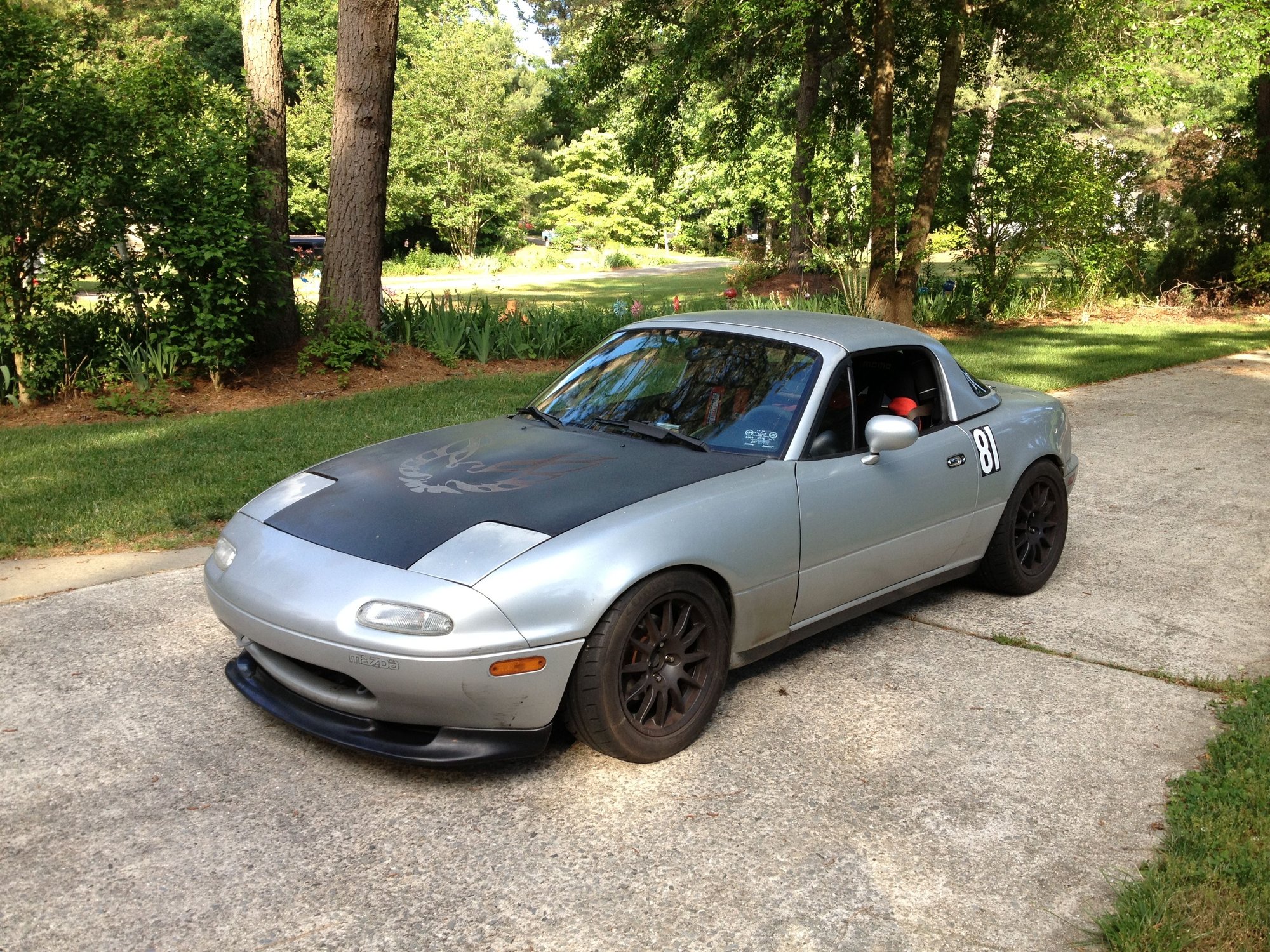
TEST LISTING - 1992 Turbo Miata Track Car -$6500

For Sale

1992 Mazda Miata

03-19-2021, 01:42 PM | Replies: 31 | Views: 1033
  • 1992 Mazda Miata - TEST LISTING - 1992 Turbo Miata Track Car -$6500 - Used - VIN 12345678901234567 - 162,000 Miles - 4 cyl - 2WD - Manual - Convertible - Silver - Germany
  • 1992 Mazda Miata - TEST LISTING - 1992 Turbo Miata Track Car -$6500 - Used - VIN 12345678901234567 - 162,000 Miles - 4 cyl - 2WD - Manual - Convertible - Silver - Germany
  • 1992 Mazda Miata - TEST LISTING - 1992 Turbo Miata Track Car -$6500 - Used - VIN 12345678901234567 - 162,000 Miles - 4 cyl - 2WD - Manual - Convertible - Silver - Germany
  • 1992 Mazda Miata - TEST LISTING - 1992 Turbo Miata Track Car -$6500 - Used - VIN 12345678901234567 - 162,000 Miles - 4 cyl - 2WD - Manual - Convertible - Silver - Germany
IB Staff
Join Date: May 2012
Posts: 175
iTrader: (0)
 

  • Price
    $6,500
  • Location Germany
  • Condition Used
  • VIN 12345678901234567
  • Mileage 162,000
  • Engine 4 cyl
  • Drive Type 2WD
  • Transmission Manual
  • Vehicle Type Convertible
  • Exterior Color Silver
Description:

1992 Turbo Miata Track Car -$6500
1992 Mazda Miata (5spd manual)
1.6L engine - 162k miles
Factory hardtop!
AC Remove - because racecar
Depowered steering rack

Full synthetic fluids (motor, transmission, rear diff)
New belts, new hoses

Greddy turbo system (already has relief cuts in the exhaust manifold and the exh manifold stud kit)
Starion front intercooler
Flyin Miata turbo heat shield
Upgraded braided SS oil return line
Upgraded turbo downpipe

1.8L Spec Stage 2+ Clutch
1.8L OEM flywheel
1.8L driveshaft
OEM Torsen Differential (From a 1999, 4.30 gear I believe)
Short throw shifter

I recently rebuilt the shifter internals with new bushings and boots, etc for a more precise shift. Also changed the fluid in the transmission trunion.

I rerouted the original Greddy air filter location to just behind the headlight to take advantage of the cold air coming in through the scoop on the headlight cover (aftermarket). This significantly reduces your intake air temps.

Greddy E-manage tuning system (w/O2 clamp)
Greddy electric boost controller
Zeitronix wideband O2 sensor
Zeitronix fuel pressure sensor
Both systems have connections so that you can data log and custom tune.
Boomslang ECU harness
Supra 315cc injectors
Walbro 190 fuel pump

Trackspeed upper radiator shield. (prevents air from passing over the top of the radiator to improve radiator cooling).

Garage Vary front lip.
Custom aluminum under shield that runs from the front lip back under the engine. (Reduces air turbulence and lift at high speeds)

KYB AGX 8-way adjustable shocks
Ground Control coilovers with Eibach springs
Fatcat Motorsports NB shock mounts with 36mm bumpstops
Aftermarket front and rear sway bars (Flyin Miata I believe)
Front sub-frame brace

Previous owner replaced all 22 control arm bushings with new urethane bushings and also the Mazdaspeed engine and differential mounts.

Upgraded to the 1.8L brakes front and rear
New rear brake calipers
Hawk DTC-60 race pads
SS brake lines
Flyin Miata Master Cyliner Brace
I run the ATE Type 200 fluid. (Flushed twice already this year but of course you'll be expected to change it before you're next track day)

Team Dynamic 15x8 wheels
205/50/15 Kumho XS tires

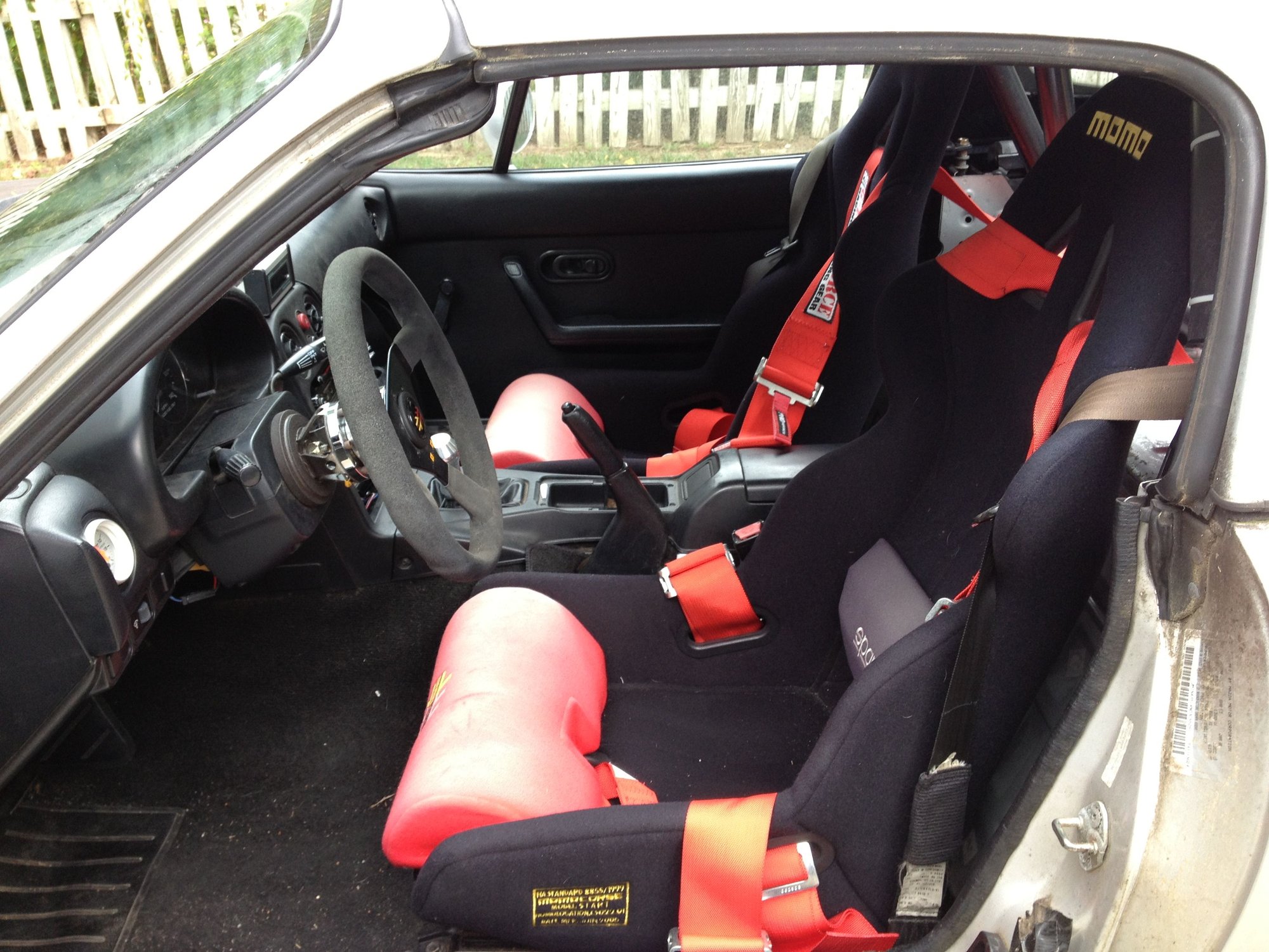
Hard dog double diagonal roll bar
Momo Start race seats
G-Force 6pt harnesses
Momo quick release steering wheel


There are plenty of cosmetic flaws and I've taken that into consideration with the price a bit, but honestly, the value in this vehicle is as a track car.

$6500 firm. I dropped the price from $7200 to $6500. That's my bottom dollar. It's a great car and worth the price.


It's been incredibly reliable (I've never had to turn a wrench on it while at the track), consumable parts like brakes and tires are cheap, and it's a great handling platform. It has served me well.

This car isn't just a collection of aftermarket parts. There's been considerable effort put into working out the kinks of making a turbo car reliable on the track. That doesn't happen by chance.

I've already done two track events this year and the car ran great the whole time. Needs nothing, just jump in and hit your next track day.

Old 03-19-2021 | 02:25 PM
  #2  
boileralum's Avatar
Senior Member
iTrader: (8)
 
Joined: Mar 2006
Posts: 1,108
Total Cats: 233
From: Indianapolis, IN
Default

This marketplace format sucks on every forum. Please don't try to fix what isn't broken on this one.
Old 03-19-2021 | 02:26 PM
  #3  
Robb M.'s Avatar
Thread Starter
IB Staff
 
Joined: May 2012
Posts: 175
Total Cats: 12
Default

What sucks about it?
Old 03-19-2021 | 02:26 PM
  #4  
msmola2002's Avatar
Senior Member
 
Joined: Aug 2017
Posts: 636
Total Cats: 323
From: Norwich NY
Default

Pls don't.
Old 03-19-2021 | 02:29 PM
  #5  
boileralum's Avatar
Senior Member
iTrader: (8)
 
Joined: Mar 2006
Posts: 1,108
Total Cats: 233
From: Indianapolis, IN
Default

It looks terrible, it doesn't flow with other posts when you view recent threads (and may not even be included). What is broken about the current FS subforums that makes you think they need to be updated? What users are complaining?
Old 03-19-2021 | 02:36 PM
  #6  
Robb M.'s Avatar
Thread Starter
IB Staff
 
Joined: May 2012
Posts: 175
Total Cats: 12
Default

Can you clarify what you mean by this?
it doesn't flow with other posts when you view recent threads (and may not even be included).
simple fact is the marketplace gets more traffic than forums, on every site we've added it to.
Old 03-19-2021 | 02:49 PM
  #7  
boileralum's Avatar
Senior Member
iTrader: (8)
 
Joined: Mar 2006
Posts: 1,108
Total Cats: 233
From: Indianapolis, IN
Default

Does it get more traffic than the previous FS forums got, or just you are able to track it now? It looks like ***. When you open this thread in a list of recent threads, you have to re-orient what you are looking at. I'd wager that a large percentage of users who still use this forum use the New Posts button to view all recent activity, and clicking onto a thread in this format is just gross. Again, what users are complaining about the current setup?
Old 03-19-2021 | 02:50 PM
  #8  
Robb M.'s Avatar
Thread Starter
IB Staff
 
Joined: May 2012
Posts: 175
Total Cats: 12
Default

Interesting feedback, thank you. more traffic than the previous forum(s), yes.
Old 03-19-2021 | 02:53 PM
  #9  
deezums's Avatar
Elite Member
iTrader: (3)
 
Joined: May 2014
Posts: 3,146
Total Cats: 201
From: Kansas
Default

Waste of space for no reason. I ******* hate these dumbass scripted gallery things. What is that, 640x480? Is it 1998? Or are you just pushing the abhorrent mobile format with all it's scaling issues to the desktop site?

Why is the user on the right side of the screen, did you all plan on moving to Arabic? Every forum I've been on, the username block with avatar is on the left, and it continues for the entire posting so I know what the **** I'm reading. I guess when we are selling things it goes to the right, unless we are replying to things in the very same marketplace thread, then it's normal. Great.

Half baked dumbass ideas nobody even asked for.
Old 03-19-2021 | 02:53 PM
  #10  
concealer404's Avatar
Elite Member
iTrader: (3)
 
Joined: Aug 2011
Posts: 10,917
Total Cats: 2,203
Default

Idea: Leave BOTH, acquire BOTH the traffic.

Pump up your numbers, and those of us that don't want to look at Marketplace trash, don't have to.
Old 03-19-2021 | 02:57 PM
  #11  
Robb M.'s Avatar
Thread Starter
IB Staff
 
Joined: May 2012
Posts: 175
Total Cats: 12
Default

Originally Posted by deezums
Waste of space for no reason. I ******* hate these dumbass scripted gallery things. What is that, 640x480? Is it 1998? Or are you just pushing the abhorrent mobile format with all it's scaling issues to the desktop site?

Why is the user on the right side of the screen, did you all plan on moving to Arabic? Every forum I've been on, the username block with avatar is on the left, and it continues for the entire posting so I know what the **** I'm reading. I guess when we are selling things it goes to the right, unless we are replying to things in the very same marketplace thread, then it's normal. Great.

Half baked dumbass ideas nobody even asked for.
Sound feedback. The image size is because it's originally from a 2012 listing.
Old 03-19-2021 | 02:57 PM
  #12  
Robb M.'s Avatar
Thread Starter
IB Staff
 
Joined: May 2012
Posts: 175
Total Cats: 12
Default

Originally Posted by concealer404
Idea: Leave BOTH, acquire BOTH the traffic.

Pump up your numbers, and those of us that don't want to look at Marketplace trash, don't have to.
duplicate content helps nobody, unfortunately.
Old 03-19-2021 | 03:11 PM
  #13  
deezums's Avatar
Elite Member
iTrader: (3)
 
Joined: May 2014
Posts: 3,146
Total Cats: 201
From: Kansas
Default

Originally Posted by Robb M.
Sound feedback. The image size is because it's originally from a 2012 listing.
But it's like 2000x1500, the stupid script gallery makes it dial up size for no good reason.

I also can't see photos from the post editor screen, the topic review section. Something I used all the time.

I know it's a test, sure hope it's an early one. Sure wish you'd leave well enough alone...
Old 03-19-2021 | 03:12 PM
  #14  
Robb M.'s Avatar
Thread Starter
IB Staff
 
Joined: May 2012
Posts: 175
Total Cats: 12
Default

Originally Posted by deezums
I also can't see photos from the post editor screen, the topic review section. Something I used all the time.
can you elaborate what you mean here? I can see an image in the editor?


Old 03-19-2021 | 03:13 PM
  #15  
concealer404's Avatar
Elite Member
iTrader: (3)
 
Joined: Aug 2011
Posts: 10,917
Total Cats: 2,203
Default

Originally Posted by Robb M.
duplicate content helps nobody, unfortunately.
Sure it does. It helps you, which is the entire reason why the idea was started in the first place.
Old 03-19-2021 | 03:22 PM
  #16  
Robb M.'s Avatar
Thread Starter
IB Staff
 
Joined: May 2012
Posts: 175
Total Cats: 12
Default

Originally Posted by concealer404
Sure it does. It helps you, which is the entire reason why the idea was started in the first place.
no, duplicate content hurts.
Old 03-19-2021 | 03:31 PM
  #17  
msmola2002's Avatar
Senior Member
 
Joined: Aug 2017
Posts: 636
Total Cats: 323
From: Norwich NY
Default

Originally Posted by Robb M.
no, duplicate content hurts.
you mean like this?

Old 03-19-2021 | 03:34 PM
  #18  
thebeerbaron's Avatar
Senior Member
iTrader: (1)
 
Joined: Dec 2007
Posts: 695
Total Cats: 354
From: San Jose
Default

Originally Posted by deezums
Waste of space for no reason. I ******* hate these dumbass scripted gallery things. What is that, 640x480? Is it 1998? Or are you just pushing the abhorrent mobile format with all it's scaling issues to the desktop site?

Why is the user on the right side of the screen, did you all plan on moving to Arabic? Every forum I've been on, the username block with avatar is on the left, and it continues for the entire posting so I know what the **** I'm reading. I guess when we are selling things it goes to the right, unless we are replying to things in the very same marketplace thread, then it's normal. Great.

Half baked dumbass ideas nobody even asked for.
Absolutely agree with the above. @Robb M. Fire whomever is doing your UX design, if anyone. User eXperience designers, engineers, whatever you call them are an actual thing and cannot be replaced by developers. If I showed this to our UX team, they'd lose their ****. I am not a UX designer, but things I know they'd tell you:

The new format is inconsistent with every other page on the forum.
  • As noted, this includes moving stuff from left to right for no clear reason.
  • The image gallery widget isn't used anywhere else on the forum and for good reason. The usage model for a forum is to read a thread by scrolling up and down. Now you're adding a clicking component, a left-right model, and when I click on an image, it opens a new window ... for a split second, before either my browser or the forum closes it... again, breaking the "scroll through a thread" paradigm.
  • There are now black bars around images to get them to fit into the widget. You're making the content work for the delivery mechanism, rather than delivering the content effectively.
    • This tells me that either your developers came up with a "great idea" and didn't think about the user, or you're recycling code from some other project rather than addressing your user's needs. Either way, you need better devs.
I'll leave you with one last thought.

Post hoc ergo propter hoc (After, therefore because)

I would love to see the analysis that is telling you that it because you changed the format, your forum users had more sales/purchase success.

I would settle for seeing analysis that says that because you changed the format, more eyeballs were actually delivered to your advertisers. I'm willing to bet that you're delivering more page views, but the number of eyeballs, and thus the effectiveness to your advertisers, is thee same or worse. $100. Show your work, send me your Venmo address, it's yours.

Old 03-19-2021 | 03:34 PM
  #19  
Robb M.'s Avatar
Thread Starter
IB Staff
 
Joined: May 2012
Posts: 175
Total Cats: 12
Default

the lower menu does not appear on mobile, we could probably remove that one. good catch.
Old 03-19-2021 | 03:35 PM
  #20  
msmola2002's Avatar
Senior Member
 
Joined: Aug 2017
Posts: 636
Total Cats: 323
From: Norwich NY
Default

New posts on mobile does also not segregate read posts. Mobile is painful, I set to view desktop mode on both my mobile devices - phone and tablet.


All times are GMT -4. The time now is 01:40 PM.